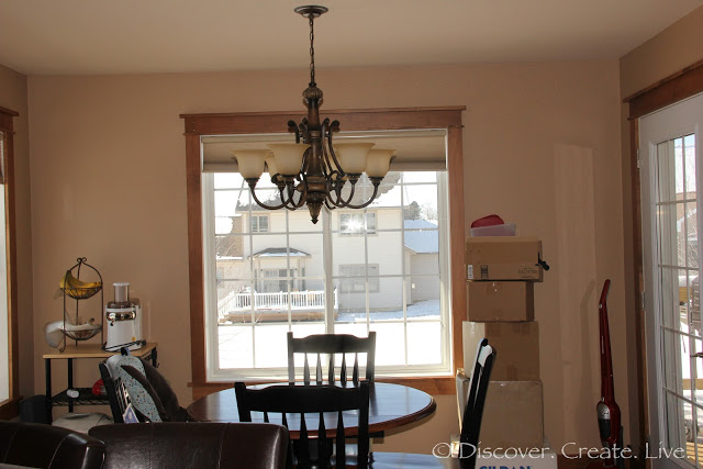
I need your help! For a while now I’ve been contemplating how exactly I want to fill the empty space on this wall:
 |
| {those “to sell on ebay” boxes have been there for months! lol I’m terrible…} |
With the help of Photoshop I came up with some rough examples of the types of things I’ve been envisioning. But I can’t decide! {By the way, my goal is to draw these up myself, so I want to keep it somewhat simple.}
 |
| these are more of a “classic” version of the “eat” and “drink” posters |
 |
| and this is a more fun/cartoony version |
I’ve also thought about moving our little cart from the corner to beside the door to make the back wall more symmetrical
 |
| {Wes thought little girl needed to be in this picture} 🙂 |
This would open up the possibility for a four piece set {which could be rectangular or square depending on what frames I can find}
 |
| we’re not huge coffee drinkers, but I’ve always thought that coffee themes look cute in kitchens {clip art modified from Kate Moore’s Know Your Coffee} |
 |
| fruit with their french names {they wouldn’t be “flat” if I went this route} |
So yes, these are just a few examples, but I’m having a terrible time making up my mind! I would LOVE some feedback on the examples here as well as any other ideas for filling this space!

I vote for the coffee photos – but I'm a coffee person.
I am not a coffee drinker either, but I do occasionally splurge on a carmel frap (I don't even know how to spell it) at starbucks. I like the coffee pics the most. It seems to be the most in between casual and formal. 🙂 I also think it's a cool idea to have the four frames and moving your little cart to the other side of the room 🙂
~Lisha
Have you thought about doing three vertical art pieces? Like breaking up the project I did into two sets of three? It was super easy and cheap.
http://www.bungalow960.com/2011/11/art-project.html
I like this kitchen art I found on interest. I like that it's more abstract, without words.
http://pinterest.com/pin/227783693622576479/
1 vote for coffee! They're just so cute 😛 lol
and that makes 2 votes for the coffee 🙂 My starbucks splurges are vanilla lattes – so good! And its ok if you can't spell it {apparently the word I used in my examples is supposed to be "cappuccino"!} Too bad photoshop doesn't have spell check 🙁
ooo I like that! It would probably be easier too since each piece would be on a smaller scale… And you even linked to your frames 🙂 I think everyone seems to be leaning towards multiple frames and symmetrical sides as well – see this is why I need you guys!
LOVE that! and it would go perfectly with Shannon's idea of using 6 images instead of four…
thanks for sharing!! 🙂
If it's helpful, I also vote for coffee. Haha. I'm not a super fan of the fruit ones. 🙂
it is indeed helpful! – I'm glad there seems to be a consensus 🙂 thanks dear!